
Many organizations such as healthcare providers, educational institutions, and public services are quickly approaching a deadline to comply with version 2.1 of W3’s Web Content Accessibility Guidelines (also known as WCAG) before April 24th, 2026.
However, if your organization is new to accessibility, it can be hard to parse what guidelines apply to your site and how. You may be wondering:
- What is the difference between A, AA, and AAA compliance?
- What content is beholden to these new rules?
- And what are the most important areas to address before the April deadline?
If you’re feeling overwhelmed trying to sort through all this information before the end of April, you’re in the right place.
The good news is that if you’re already working towards compliance with earlier WCAG versions, you’re already on track! But even if you’re completely new to web accessibility, it’s not as difficult as it may seem.
In this article:
Where did this 2026 accessibility deadline come from?
WCAG 2.1 Accessibility Checklist
Below we’ll cover the new guidelines in WCAG 2.1 to focus on if you’re already on your accessibility journey, as well as some priorities and easy wins you can focus on if you’re starting from scratch.
But first, what is WCAG?
A quick intro to W3’s Web Content Accessibility Guidelines (WCAG), and why everyone is talking about them: W3, or the World Wide Web Consortium, is an international non-profit that brings web tech experts together to develop standards and templates to make the internet work better for everyone. One set of these standards are the Web Content Accessibility Guidelines. W3 is not a governmental organization, nor are WCAG standards laws. However, as the most robust set of published digital accessibility standards, many governments around the world have based legal requirements for accessibility on WCAG guidelines.
WCAG versions are backwards compatible
Each new version of WCAG standards are backwards compatible, building on the previous one, rather than being a completely new set of guidelines. This means that if your site meets WCAG 2.0 AA standards, you’ve already done most of the heavy lifting!
If that’s the case for you, see what’s new in WCAG 2.1.
If you’re not yet up to date with previous WCAG versions, see our list of the most common web accessibility pitfalls and errors that you can quickly address without needing a developer.
What does WCAG level AA mean?
To accommodate a range of different groups and situations, WCAG standards have three levels of conformance:
- A, the lowest and most basic level
- AA, and
- AAA, the highest level.
The DOJ’s recent final rule specifies level AA conformity, which is the most commonly used conformance level. Like WCAG versions, these levels build on each other. If your site meets Level AA standards, that means it also meets Level A standards. Level AAA is the most robust, but not recommended as whole-site standards by W3 as it is not possible to satisfy all Level AAA success criteria for some content.
Where did this 2026 accessibility deadline come from?
In April of 2024, the US Department of Justice published a final rule obliging public entities to ensure their web content and mobile applications are accessible. This rule isn’t really new information, but it clarifies the existing requirements from the Americans with Disabilities Act. Public entities were technically already supposed to have accessible websites (as are public companies), but this was only established through legal precedent.
In legal proceedings referencing the ADA, judges have ruled that websites count as public space under the ADA, and when websites are found to be inaccessible, they’re most commonly ordered to meet WCAG guidelines. However, these definitions and standards aren’t law themselves. The DOJ’s rule establishes these standards beyond legal precedent.
Following the DOJ final rule, the Department of Health and Human Services published their own final rule affirming that those standards are also applied to any organizations that receive federal funds or financial assistance, or that are conducted by a federal agency.
These deadlines vary based on the type of and size of organization. Most organizations are required to comply by late April or early May of this year, but you should consult the official DOJ or HHS documents for more information.
What parts of my website have to be accessible?
The final rule says that all services, programs, and activities provided to the public via the web or mobile apps must be accessible. All web content must adhere to the relevant WCAG 2.1 AA rules, including text, images, sounds, videos, controls, animations, and conventional electronic documents. There are a few exceptions to this, and even fewer cases where “alternate conforming versions” of content may be permissible.
Content that is not required to be accessible:
- Archived web content
- Pre-existing conventional electronic documents, unless those documents are necessary to access any of your site’s services, programs or activities
- Content posted by a third party, unless the third party has a contractual or licence arrangement to post
- Conventional electronic documents about a specific person, their property, or their account that are password-protected
- Pre-existing social media posts
It’s important to note that even if the above content is not affected by this rule, you may still be required make it accessible if requested by an individual with disabilities.
Please note that this is just a summary of the requirements, and that it’s almost always better to err on the side of caution. This article does not constitute legal advice, nor does it cover every web content circumstance. For more specific guidance, please consult legal counsel and speak to an accessibility specialist who can assess your specific circumstances.
WCAG 2.1 Accessibility Checklist
To get compliant with WCAG 2.1, there are a few new success criteria to keep an eye out for. If you’ve already met the previous version of WCAG, 2.0 to the AA level, here’s how to close the gap.
The following success criteria are new in WCAG 2.1 Level AA:
- 1.3.4 Orientation (AA)
- 1.3.5 Identify Input Purpose (AA)
- 1.4.10 Reflow (AA)
- 1.4.11 Non-Text Contrast (AA)
- 1.4.12 Text Spacing (AA)
- 1.4.13 Content on Hover or Focus (AA)
- 2.1.4 Character Key Shortcuts (A)
- 2.5.1 Pointer Gestures (A)
- 2.5.2 Pointer Cancellation (A)
- 2.5.3 Label in Name (A)
- 2.5.4 Motion Actuation (A)
- 4.1.3 Status Messages (AA)
1.3.4 Orientation (AA)
This success criteria requires content to be viewable and usable regardless of display orientation. For example, a page should function the same whether viewing it in portrait or landscape orientation on mobile devices.
Testing and meeting this criteria: An easy way to check if your site passes this guideline is to explore it in both portrait and landscape mode on a smartphone. For developers, W3 recommends testing that page content is not restricted to either landscape or portrait orientation using CSS transforms.
1.3.5 Identify Input Purpose (AA)
This standard applies to forms a user may fill out. For applicable fields, ensuring that the input value can be programmatically determined helps autofill and other assistive technologies understand the expected input, and translate that expectation to meet the user’s needs depending on what technology they’re using.
For example, a field using the given-name autofill token would be able to pull in the right data whether the visible label was name, first name, given name, nom, or Ім’я.
Testing and meeting this criteria: If you’re using a form builder on your site, many already have this functionality included. You can familiarize yourself with the standard input purposes to make sure your form fields are using them whenever possible.
1.4.10 Reflow (AA)
Reflow is the action of rearranging text on a page in response to changing elements like type size, line length, or spacing. This allows lines of text and content blocks to reorder themselves to fit within the user’s viewport. Content that passes this success criteria can be enlarged (up to a certain point) without requiring scrolling in two dimensions.
Testing and meeting this criteria: The simplest way to check for this is to use your browser’s built in zoom function to view a page at different sizes. Content should still be readable without having to scroll horizontally.
1.4.11 Non-Text Contrast (AA)
This success criteria applies similar color contrast requirements as the existing rules for text to other “meaningful visual cues.” Any active user interface components (like checkboxes or favorite buttons) or graphical objects that convey important information should have at least a 3:1 color contrast ratio.
Testing and meeting this criteria: We recommend using WebAIM’s Color Contrast Checker, which includes tests for normal text, large text, and graphical objects/user interface components.
1.4.12 Text Spacing (AA)
Success criteria 1.4.12 requires content implemented by supported markup languages to maintain full functionality when line height, paragraph spacing, letter spacing, or word spacing are changed. This allows readers with visual disabilities and learning disabilities like dyslexia to adjust the size and orientation of web content to their liking.
Testing and meeting this criteria: These styles can be changed through a variety of browser addons or reader view options. W3 recommends this simple tool. When building pages where this rule is applicable, it can help to avoid adding set line heights in CSS and thoughtfully configuring your text wrapping settings.
It’s worth noting that the guideline contains this stipulation: “Writing systems for some languages use different text spacing settings, such as paragraph start indent. Authors are encouraged to follow locally available guidance for improving readability and legibility of text in their writing system.”
1.4.13 Content on Hover or Focus (AA)
This success criteria was written to allow users navigating content without a mouse to access content that appears on hover focus. Many assistive technologies, from screen readers to point and sip devices, provide users with non-pointer navigation tools, so making sure that content is available without the use of a mouse is crucial.
This guideline specifies that users can interact with hover content and dismiss this content without moving focus, and that the content remains visible until the focus is removed or the information is no longer relevant.
Testing and meeting this criteria: This criteria is best tested with relevant assistive technology.
2.1.4 Character Key Shortcuts (A)
This criteria governs the use of certain keyboard shortcuts. It requires that keyboard shortcuts can be turned off or remapped, and that an active shortcut only works when the item it is meant to manipulate is in focus. This allows users to maintain their own assistive setups and shortcuts.
Testing and meeting this criteria: This success criteria does not denote any specific way to provide these controls, they just have to be available to the user.
2.5.1 Pointer Gestures (A)
This largely concerns the use of touchscreen interfaces. It requires that most multipoint or path-based gestures for operation can be operated with a single pointer, and without a path-based gesture. A multipoint gesture is one that requires more than one touchpoint on the screen at once, such as a two-finger pinch zoom. Path-based gestures, commonly used in navigating sliders and carousels, require movement from one point to another in a fairly straight path. Drag-and-drop gestures, where the path doesn’t particularly matter as long as the pointer goes from point A to point B, are not beholden to this success criteria.
Testing and meeting this criteria: Ensure that there are alternative methods of interacting with content. For example, make sure there are zoom in and zoom out buttons on a map or clickable arrow controls on sliders.
2.5.2 Pointer Cancellation (A)
This success criteria helps standardize pointer interactions to work as users expect. Pointer interactions are most commonly executed with a computer mouse (i.e. clicks), but a variety of assistive technologies provide other ways to manipulate the cursor.
This rule stipulates that any pointer interaction must adhere to at least one of the following rules:
- No action is triggered by only the down event (such as a click-and-hold),
- The action that the pointer interaction is meant to perform is triggered on the up-action, rather than the down action, and there is a way to abort the interaction before the up event. In action, this looks like when you click a button, the button is only pressed with a full click, not just a click-and-hold.
- The up event reverses any effect of the down event (like releasing the mouse in a drag-and-drop interaction before the action is finished), OR
- Completing the interaction on the down action is necessary.
This set of rules is meant to address a wide variety of pointer interactions, which is why only one of the rules above must be true.
Testing and meeting this criteria: This can be tested by trying the pointer interactions across your site.
2.5.3 Label in Name (A)
This success criteria states: “For user interface components with labels that include text or images of text, the name contains the text that is presented visually.” In this case, “name” refers to text by which software can identify an element within web content to the user.
In short, this rule says that the interface component name that assistive technologies perceive (such as from ARIA roles or HTML labels) should match the one that users visually see. This helps text-to-speech users interact with the page in a predictable way.
For example, here’s a screenshot of the email field of a form. The inspect window is open at the bottom of the image, showing that the field labeled “Email” on the page also has the div label “Email.”
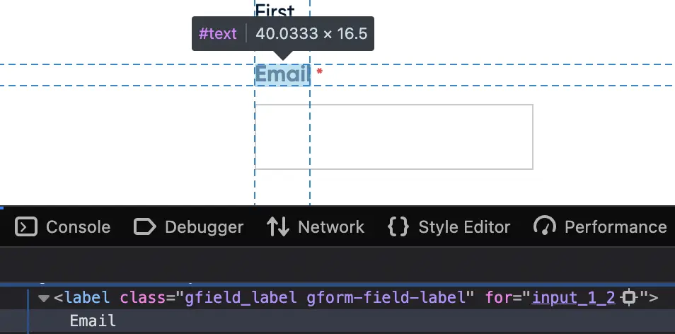
Testing and meeting this criteria: This article explains how the names for elements are determined. The item name can be changed within the applicable markup language, or the visible label can be changed to match the existing name attribute.
2.5.4 Motion Actuation (A)
This rule governs interactions based on user or device movement, such as shaking a mobile device to undo an action. This rule, in short, says that all motion actions a) have alternatives that don’t require motion, and b) can be turned off to avoid accidental triggering.
This success criteria helps users with a wide range of mobile disabilities, whether they’re not able to perform the shake motions, or they’re not able to hold a device still.
Testing and meeting this criteria: There is no specific method defined for providing alternative controls or a way to disable motion interaction. Depending on your site and the number of elements this rule applies to, you can offer alternatives element-by-element, or through full-site user settings.
4.1.3 Status Messages (AA)
This success criteria requires that any status messages can be perceived by assistive technology without needing to receive focus. Status messages are defined as a change in content that provides information to the user on the results of an action, the waiting state of an application, the progress of a process, or the existence of errors. This helps screen reader users in particular, as many blind or low-vision users would otherwise have no way to know there’s a status message to move focus to in the first place.
Testing and meeting this criteria: This criteria is best tested with the relevant assistive technology.
WCAG Priorities and Easy Wins
Web accessibility is first and foremost a crucial inclusion practice, but these new final rules (plus a host of high-profile lawsuits) have brought awareness to the legal ramifications of web accessibility as well. From these lawsuits, we can determine which issues tend to impede users most often. The barriers most commonly cited in ADA web accessibility lawsuits are:
- Alt text issues
- Insufficient color contrast
- Form issues
- Inaccessible links
While fixing these issues won’t necessarily make your site fully compliant or legally safe, it does remove the low hanging fruit that some potential plaintiffs may be looking for. And more importantly, many of these are easy to address without developer assistance and all of them make a big impact on your site’s usability.
There are a number of free tools to scan your site for accessibility issues. We like SiteImprove’s Chrome extension, but WAVE and Axe devtools are also popular. It’s important to note that these tools aren’t replacements for human assessment, as many WCAG standards operate in specific contexts that automated tools aren’t able to parse. However, they’re a great place to start!
Alt text
Alt text, short for alternative text, is a small description of an image that is read aloud by screen reader software used by blind or low-vision users. Adding alt text is usually simple- most site platforms and CMS programs have alt text fields already.
Do all images need alt text?
Short answer: nope.
Long answer: it depends on if the image is decorative or informative. Decorative images, like the rendering of pink and orange lines shooting over a black background at the top of the page, are purely for aesthetic. Many blog header images fall into this category, as do visual styling elements such as borders, spacers, and corners. WCAG standards for decorative images specify that they should have an empty alt text attribute. Adding alt text to decorative images can actually make your site more difficult to navigate with a screen reader!
In contrast, informative images are, well, informational. All informational images should have alt text, unless they are already described by surrounding text. Effective alt text is short, usually no more than 150 characters, and conveys the meaning of the visual content instead of just a literal description. (For length reference, the previous sentence is exactly 150 characters.) One major area sites tend to run into trouble is with images containing text, such as digital flyers, hero images, or images used as buttons.
When it comes to writing good alt text, the most important question to answer is “what information would be missing if this image wasn’t here?” For example, if you include a logo in a list of companies, the name of the company is probably important to include in the alt text, but the color of the font in the logo isn’t. For more on writing good alt text, check out our blog post.
Insufficient color contrast
When text and background colors on your site don’t contrast enough, it’s difficult for users to read. When sites have consistent color contrast issues, we often recommend bringing in a designer to help adjust your branding. But for smaller issues, slight color tweaks or even just making the text larger can bring it into compliance. WebAIM provides a great tool to check color contrast, and it also provides helpful visual examples of how color combinations will work across different text sizes and user interface components.
Form issues
There are a number of accessibility stumbling blocks when it comes to forms, but luckily many of them are easy to fix if you have even passing familiarity with your form builder of choice. Here are a few issues to look out for:
Using field placeholder text as instructional
Sometimes placeholder text can be used as an extra space for notes, such as formatting instructions, like the phone number format in the field below:
On the one hand, it is important to communicate to users if they need to input their phone number a specific way. However, that placeholder text disappears as soon as users start typing. Here’s a better example:
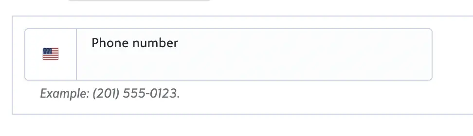
The important formatting info is noted below the input box, which keeps it visible as users are filling the field.
This also causes a problem when the placeholder text is used as the field label itself. In the screenshot below, the only label for the field is the placeholder text that reads “email address,” with no other visual labels. This is a common form setup, but it can cause issues for a wide variety of users.
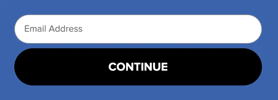
First, the label disappears as soon as a user starts typing. This can be challenging for users with cognitive disabilities, or even just distracted users. As well, some screen readers skip placeholder text. Unless the field has a separate label visible or encoded in the form, blind and low-vision users receive no guidance on what input is required.
If your forms currently rely on placeholder text within the field for important directions, now is the time to add separate form labels and instructions.
CAPTCHA systems
Due to the visual nature of CAPTCHA questions and the challenges for users with cognitive disabilities, as well as keyboard inaccessibility, we don’t recommend interactive CAPTCHAs as spam prevention for your forms.
Some alternatives for non-interactive spam protection are Cloudflare Turnstile or Cleantalk. If your form builder allows, you can also use multi-factor authentication like email verification.
Here’s more in-depth info from W3 on CAPTCHA alternatives.
Other common form issues
- Color contrast failures
- Overly complicated forms – use pagination or conditional logic to limit the number of fields a user has to navigate at once
- Time limits – when timed forms are necessary, users should be clearly notified as such and given the option to extend their time.
Inaccessible links
Here are a few guidelines to help you create compliant, informative, and navigable links:
- Link text should describe what the text links to without relying on other elements on the page.
- Link text should be consistent. Links that go to the same source should use the same text, and links that go to different sources should have different link text.
- Link styling should be consistent, color contrast compliant, and convey information without solely relying on color.
- Don’t use full URLs as link text, as they can be unwieldy for screen readers.
Overall, try to avoid using vague phrases like “click here” or “read more,” as those rarely provide enough context on their own, and can often lead to the same phrase being used for different links. We see this most commonly on blogs, where each snippet has a “read more” button. As an alternative, making the blog title itself a link is simple and clear.
Accessibility compliance is within reach
While the rules may seem daunting, everyone on your digital team can do something to help make your web content more inclusive. Even if your site isn’t beholden to this upcoming deadline, it’s never too early to start your web accessibility journey! Even if you aren’t a public entity or healthcare organization, you may still be at risk for an ADA lawsuit any time.
The digital landscape is constantly changing as new web trends emerge, new laws are passed, and new assistive technologies develop, but following WCAG guidelines will help ensure that your site is ready for these changes and welcoming to all.
P.S. Are you a small business? If so, you may be entitled to a tax credit of up to $5000 for web accessibility services.
Talk to one of our accessibility experts today to get started.