
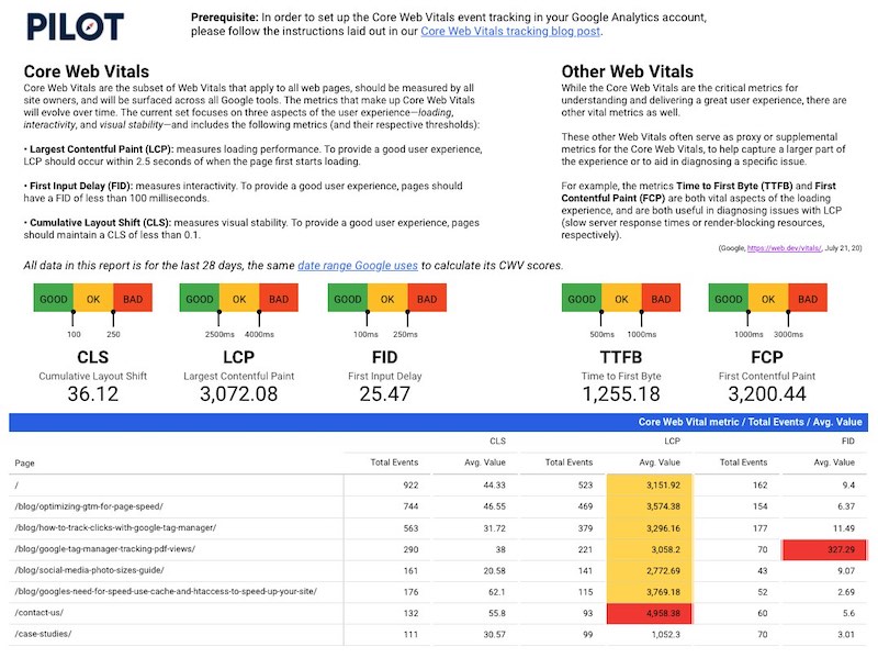
Pilot’s Google Data Studio dashboard for monitoring Core Web Vitals
With Google moving to integrate their Core Web Vitals into the ranking algorithm, it’s important for webmasters and SEOs to monitor how their site performs for these metrics. However, the Core Web Vitals data that Google gives us in Google Search Console is very limited — at best, we’re given a few examples of problem pages… not much to go off of if you’re serious about improving your site’s performance.
To get accurate direction on how to improve, you can use Google Tag Manager to push page-specific Core Web Vital event data to Google Analytics. Follow the link to our blog post below for a guide on the prerequisite set-up.
Prerequisite to the Data Studio Report: Gather the Core Web Vitals data in Google Analytics
To gather the data that we’re monitoring with this dashboard, we used Google Tag Manager to push event data for each web vital into our Google Analytics account. How do you do this? Well, we wrote a blog post on how to monitor core web vitals in Google Analytics for your reading pleasure! Before proceeding with the rest of this guide, please follow the instructions in that blog.
Learn how to set up Core Web Vital tracking →
Now that you’re tracking Core Web Vital event data in Google Analytics, you can set about displaying that data in an easy-to-monitor format in a Google Data Studio report. Lucky for you, we’ve already made the report!
Copy our Data Studio Template
Google Data Studio lets you duplicate a report using your own data source, meaning you can make our report your own by drawing from your own Google Analytics account. Here’s how to do that:
- Duplicate the report by clicking this icon (must be logged into a Google account):

- In the “New Data Source” field, connect your Google Analytics account to the report.
- Follow the steps below to finish your report.
Disclaimer: there is a bit more legwork you’ll need to do in order to get your report in full working order, but we’ve provided the details for that legwork below.
The steps below explain exactly how we set the report up, and by retracing these steps you can get your report working. Please pay special attention to the following, since the copying of a Data Studio report does not automatically add custom dimensions to your data source, which is required for this report:
- Step 1 — the creation of the custom dimension in your Google Analytics data
- Step 2 — the filters on your scorecards will need to be recreated
- Step 3 — the pivot table’s Column Dimension will need to be changed to your new custom dimension, and the pivot table filter will need to be recreated
- Step 4 — the conditional formatting will be need to be recreated
How we created the dashboard
Step 1: Creating a Custom Dimension in the Google Analytics data source for “Core Web Vital type”
Since Google Data Studio (and Google Analytics, for that matter) views all Events as one dimension, we want to create a custom dimension in our Google Analytics data source that will use the Event Action to differentiate our Core Web Vital events as separate values — i.e. CLS (cumulative layout shift) will be its own entity in our created “Core Web Vital Type” dimension, allowing us to show multiple events in several columns of the same table.
To achieve this, we need to edit our Google Analytics data source:
- Go to Resource → Manage added data sources
- Select “Edit” on your Google Analytics data source
- Click to “Add a Field” (with a plus sign next to it)
- Name your field: “Core Web Vital metric”
- Copy and paste the following into the “Formula” field, then Save:
CASE
WHEN Event Action ='LCP' THEN 'LCP'
WHEN Event Action ='FID' THEN 'FID'
WHEN Event Action ='CLS' THEN 'CLS'
WHEN Event Action ='TTFB' THEN 'TTFB'
WHEN Event Action ='FCP' THEN 'FCP'
ELSE 'Other' END
You have just used the Event Actions to separate your Core Web Vital events into separate values in a newly created dimension, called “ Core Web Vital metric.” More on why that’s necessary in Step 3.
Step 2: Creating the scorecards for each Web Vital
To show the average values of each Web Vital across our entire site, we added 5 scorecards to the report (Insert → Scorecard). For each of the 5 scorecards, we did the following:
- Select “Avg. Value” as the metric
- Edit the metric by clicking the AUT on the left of the metric (which will turn into a little pencil on hover):

- Change the name of the metric to represent one of the Web Vitals, e.g. “Cumulative Layout Shift.” This doesn’t actually do anything to the way the report functions, but it will help you keep track of which scorecard is representing which Web Vital.
- Add a Scorecard filter to the scorecard. Name the filter “CLS,” and set it to Include → Core Web Vital metric → Equal to (=) → CLS
- Once you hit Save, your scorecard should be showing the average Cumulative Layout Shift value for all events collected in your Google Analytics account (over the default date range, the last 28 days).
- Repeat this for each of the Web Vital metrics: LCP, FID, TTFB, and FCP.
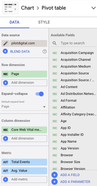
Step 3: Creating the Pivot Table
To drill down the Core Web Vital data to the page level, we added a pivot table to the report that will show the average values of the three Core Web Vitals (CLS, LCP, and FID) for each page that has collected data. Since these are all events, this would typically be impossible to show in one table — our table would not allow us to show multiple events side-by-side in columns of the same table, they would just show in one combine column. This won’t do!
By using the “Core Web Vital metric” custom dimension we created in Step 1, we can get around this obstacle. Here’s how we set up the pivot table:
- Insert → Pivot table
- Add “Page” as the row dimension
- Add our custom dimension, “Core Web Vital metric,” as the column dimension
- In the metrics, add “Total Events” and “Avg. Value”
- We add “Total Events” so that we can add some context to our average value — how many values is our average being calculated from?
- The pages with the highest values in “Total Events” are likely the most trafficked pages.
- Add a Pivot Table filter to the table. Name the filter “CLS / LCP / FID,” and set it to Exclude → Core Web Vital metric → RegExp Match → Other|TTFB|FCP
- This excludes all events except the three Core Web Vitals. If you’d like to include the TTFB and FCP in your pivot table, feel free to remove them from the RegEx, but know that you may have to make the font size in the table smaller to fit all that data into a visible width.
- Sort the table by descending “Total Events” to see your most popular pages toward the top of the table.
Now you can see how each of your pages scores on average for Google’s Core Web Vitals.
Step 4: Writing conditional formatting rules in Data Studio
In order to make our pivot table a bit easier to scan, we added conditional formatting rules that will color our Core Web Vital values yellow or red if they fall under the “Needs Improvement” or “Poor” thresholds, respectively.
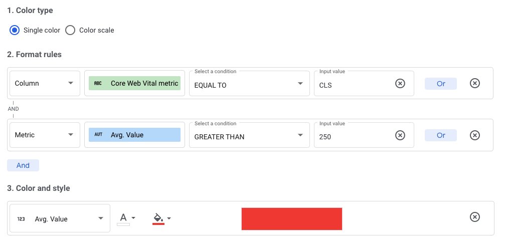
Here’s how we mark CLS values that are “Poor” in the color red:
- Click the pivot table, and go to the “Style” settings
- Under “Conditional formatting,” click the “Add” with the plus sign
- Color type:
- “Single color”
- Format Rules:
- Column → Core Web Vital metric → EQUAL TO → CLS
- AND
- Metric → Avg. Value → GREATER THAN → 250
- Color and style:
- Avg. Value
- Background color: RED
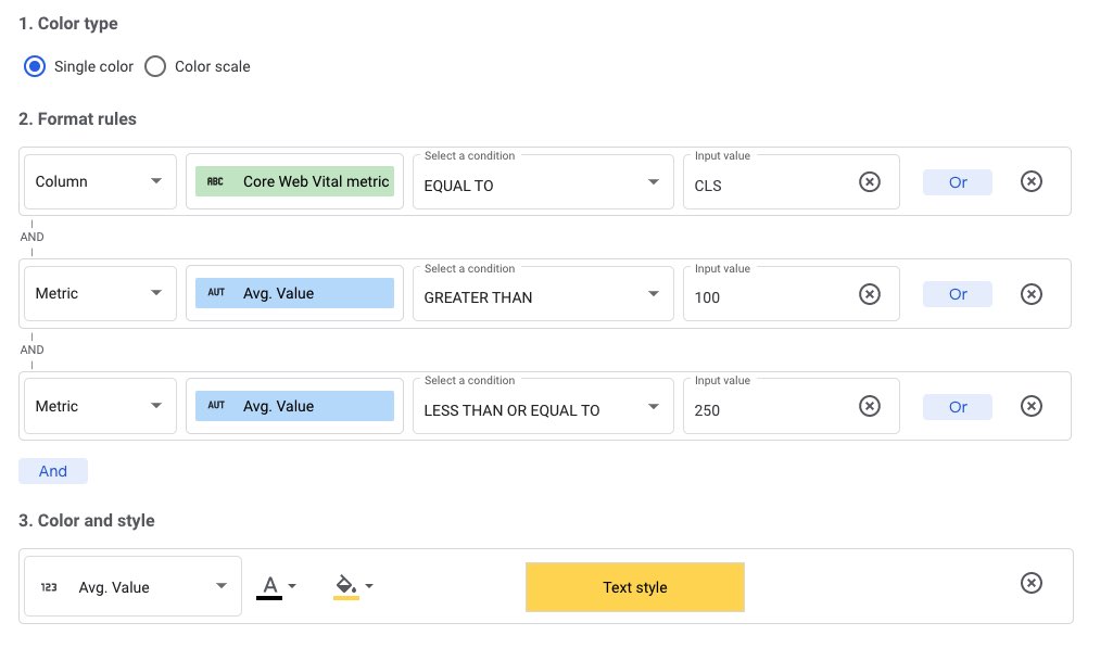
Here’s how we mark CLS values that “Need Improvement” in the color yellow:
- Under “Conditional formatting,” add another rule
- Color type:
- “Single color”
- Format Rules:
- Column → Core Web Vital metric → EQUAL TO → CLS
- AND
- Metric → Avg. Value → GREATER THAN → 100
- AND
- Metric → Avg. Value → LESS THAN OR EQUAL TO → 250
- Color and style:
- Avg. Value
- Background color: YELLOW
Make rules for the other Core Web Vitals with the following thresholds (given by the Google Developers blog):
- LCP
- 2500—4000 = YELLOW
- >4000 = RED
- FID
- 100—300 = YELLOW
- >300 = RED
If you are having any trouble setting up your own Google Data Studio dashboard, please don’t hesitate to reach out to info@pilotdigital.com for help!