The Rhetoric of Web Design—Part 3: Emotion
You’ve labored to get people to visit your site. Advertising, SEO, content, social media, emails, PR—it’s all been in an effort to drive visits.
As mentioned in the previous articles in this series, those visitors shouldn’t go to waste. Your business makes no money from visits alone. And by tapping into principles of rhetoric, you can turn people from passive link-clickers into long-lasting customers.
The first two articles covered how:
- Earning trust prevents people from bouncing off your site.
- Using logic captures attention.
and now… - Appealing to emotion drives action.
The best website is aware of all three elements in their user experience to grease the wheels of conversion for every visitor.
But why is emotion so important for initiating a conversion? Simply put, it’s because deep down, we base our final decisions on emotion. A purely logical approach to a decision can leave us in an endless loop of pros and cons.
“Well on one hand, that car has more storage space. On the other hand, this car has more standard features…”
Without a feeling associated with either option, this circular, inner monologue can go on forever.
“I love this car. I’ll take it.”
It’s the presence of emotion that triggers confident decisions.
Positive Emotions Trigger Purchases
Just like in the above example, your goal is to associate positive emotions with your brand or with your desired action.
Benefit over Feature
Think about the benefit of your product or service. Does it save time? Reduce clutter? Now think deeper. What kind of emotion does this benefit elicit? Joy? Pride? Relief?
Highlight that emotion in your copy leading up to your call-to-action. Make it clear what ultimate benefit it is they are truly signing up for.
Thrill of the Deal
JCPenney made a big mistake a couple years ago, eliminating sales and thinking that a constant, low price would take the game-playing hassle out of shopping.
But the best part of game-playing is the thrill when you’ve won. And that’s what sales and discounts provide—the sensation that you’ve somehow beat the system. Subsequently, JCPenney sales plummeted, as the shopping experience provided nothing but the sensation of cost and loss—even if the end-price would have been identical to a “sale” price.
Take a lesson from this and provide deals on your website. Just be sure to include everyone on the action. When someone reaches a page for promo codes and they don’t have one, it makes them jealous and angry that other people have a coupon that they don’t.
Surprises
If you aren’t sure how to sow such ideal emotions like joy or affection into your customer relationships, then surprises are a great surrogate for positive emotion. Whether it’s an unexpected deal, a complimentary service, or some other sudden perk, surprises go a long way in shaping a favorable impression since they are, by definition, acts of kindness above and beyond the commercial contract the customer was expecting.
Customer Service is the Kingmaker
Customer service is perhaps the most recurring source of emotion in your customers. And this ongoing relationship can start right on your website before they even take their first action. Here are some quick ways that customer service can bridge the digital divide and make a cheerful, human connection with your customers.
- Offering convenient contacts, like direct phone numbers or instant messaging widgets onsite
- Showing smiling photos of employees
- Asking for input with surveys or open-ended contact forms
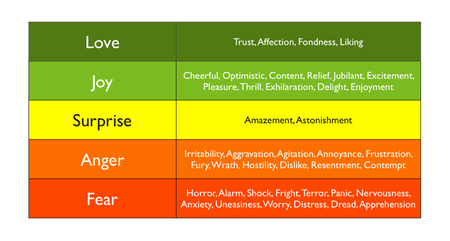
This emotion ladder, created by Conversion Team, shows the hierarchy of emotions that you should pay attention to when interacting with your customers.

Negative Emotions—The Double-Edged Sword
Traditional marketing has always relied on spreading FUD around. What’s FUD? Fear, Uncertainty, and Doubt, primarily directed at competitors. If you can make a customer feel even one of these emotions toward your competitors, then they’re more likely to choose you instead.
Creating anxiety in potential customers has been a common marketing strategy, the thought being that if you can associate your brand as some kind of patch or cure for a specific (or invented) anxiety, then you’re leveraging one of the most potent, survivalist emotions in your favor.
Today, however, businesses can’t rely on scaring folks into their buying funnel. While you may get an initial sale out of it, long customer relationships are built on reinforced positivity, rather than a bland lack of negativity or an invented dependency.
On a related note, you want to make sure your web design never initiates any negative emotions. If anyone is ever prompted to feel…
- Confused (poor design)
- Angry (additional charges)
- Jealous (exclusive promos)
- Fearful (lack of information)
…then they will bounce off your site in a heartbeat. Always remember: online customers have ZERO perceived investment in their visit. Unlike families that take day trips out to a car dealership, there is very little investment of time or energy into the exchange, and folks are a lot less reluctant to sever ties immediately.
Collectivity Trumps Isolation
Let’s take a step back from marketing for a second — there is no greater, underlying fear than being completely alone in the universe.
Chilling.
That fear motivates a lot of different behaviors. And on an individual level, it means that people respond better when they feel like they are part of a group or community as opposed to being alone.
This feeling can be leveraged with a simple switch of pronouns from “I” to “we” or “you” to “us.” It depends on the context of the copy, but using a collective voice can provide that warm impression of inclusion and safety in numbers—a feeling we all respond to if only in our reptilian brains.
The Role of Color in Converting
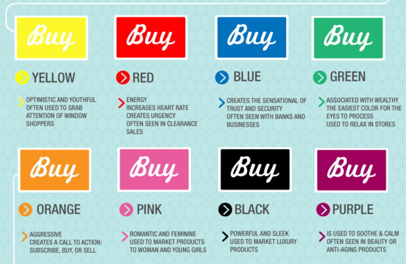
It’s no surprise that colors have associated emotions. Blue is calming, red is exciting, etc. Most companies choose their brand colors with a very deliberate sense of what emotion they want to summon at first glance.
While you don’t have to go back and redesign your entire branding, you can pay attention to how colors operate on different pages of your website, particularly conversion pages and their corresponding CTA buttons.
The below chart shows the emotions that each color provokes. A couple of notes:
Different businesses in different industries probably want to provoke different emotions. So a life insurance company might go with blue, while a sky-diving company might go with red. And the funeral home might go with purple or green.
Also, no matter what color you choose for your conversion button, it should contrast with the rest of the page design. Being noticed is half the battle.

Storytelling is Human
…and we all want to be human
These days, marketers tout the importance of storytelling so much, that it’s practically become a buzzword. But there’s a reason it’s so popular—it triggers emotion and unlocks empathy in your audience, establishing a much more genuine, human connection.
If you aren’t sure what emotion your business elicits, what color to make your buttons, or how to create a positive relationship with your customers, you can at the very least use stories to humanize your company. Because even though robots run the show online, business will always be a person-to-person enterprise.

