Editing a website can be fun and exciting. There are a lot of options for different types of blocks and elements you can use. And there are many opportunities to implement fun images, graphics and colors to make your site super engaging. However, while it can be easy to get carried away with adding fun features and visuals, it’s important to remember how to make sure your website is accessible – so everyone can enjoy what you’ve created!
The impact of inaccessible color combinations
If colors on your website don’t meet accessibility standard best practices, you’re likely going to limit who can use your website. It makes it difficult for those with colorblindness to distinguish the difference between two colors layered on top of one another if that color combination is not accessible.
When websites fail to provide users with visual disabilities with sufficient contrast between foreground and background colors, it hinders their ability to perceive and navigate the content effectively. This exclusion can lead to frustration, discouragement, and ultimately, a loss of potential visitors or customers. Also, individuals with color vision deficiencies or various visual impairments may find it difficult or impossible to discern critical information, such as buttons, links, or error messages.
Inaccessible color combinations also violate web accessibility guidelines and legal requirements in many regions, exposing businesses to potential lawsuits and reputational damage. On the other hand, implementing thoughtful color choices that accommodate a diverse range of users can enhance inclusivity, broaden the site’s audience, and reinforce the brand’s commitment to providing an equitable online experience for all.
Users will see different colors in the same image depending on the type of colorblindness they may experience.
Why it’s important to make sure colors are accessible on your website
Ensuring that colors are accessible on websites is important for many reasons. First and foremost, accessibility in web design promotes inclusivity, allowing people with various visual impairments or color vision deficiencies to access and navigate the content seamlessly. By adhering to accessible color schemes, websites become more welcoming and usable to a broader audience, ultimately enhancing the user experience for everyone.
Accessible color schemes contribute to improved readability and comprehension of website content.
Make sure colors are accessible
You can check your color contrast using the tools below:
- Color Blindness Simulator – You can insert your current website URL to see how people with different types of vision can see the colors on your site.
- Color Contrast Checking Tool from WebAIM – This tool from WebAIM lets you paste in the foreground and background color hex codes to determine the contrast ratio. If your combination does not have adequate contrast, you can toggle using the bars to find a similar, more accessible alternative to your current color.
- Contrast Ratio: This tool allows you to input foreground and background colors to calculate the contrast ratio and determine if they meet the accessibility requirements.
- Stark: Stark is an accessibility tool that integrates with design software like Sketch, Adobe XD, and Figma. It not only checks color contrast but also offers other accessibility features.
- Color Safe: This tool generates accessible color palettes and provides contrast ratio information for text and background combinations.
- A11y Color Palette: This tool helps designers create accessible color palettes by providing contrast information for different text sizes.
- Lighthouse: Lighthouse is a web development tool provided by Google Chrome DevTools. It includes an accessibility audit that checks for color contrast and other accessibility issues on web pages. To access it, open Chrome DevTools, go to the “Audits” tab, and run the accessibility audit.
- If you have an Adobe Creative Cloud account you can access Adobe Color Wheel.
These tools will help you ensure that your website meets color contrast accessibility standards, making it more inclusive and usable for all users, including those with visual impairments.
Examples of color combinations that do not meet web accessibility standards
The more you research inaccessible colors combinations, you can more readily begin to identify what is accessible and what isn’t. That knowledge, paired with solid testing tools, will set you up for success! Below is a sample list of color combinations that don’t meet web accessibility standards.
#FF0000 (Red) on #00FF00 (Lime Green)

This combination results in low contrast, making it difficult for individuals with visual impairments or color blindness to read the content.
#FFFFF0 (Ivory) on #FFFF00 (Yellow)

This combination also lacks sufficient contrast, causing readability issues for many users, particularly those with low vision.
#00BFFF (Deep Sky Blue) on #1E90FF (Dodger Blue)

Although both colors may seem distinct, they still fail to meet the minimum contrast requirements, leading to readability problems.
#008000 (Green) on #008080 (Teal)

While these colors might appear different to sighted users, the contrast ratio is inadequate, making it hard for some individuals to discern the content.
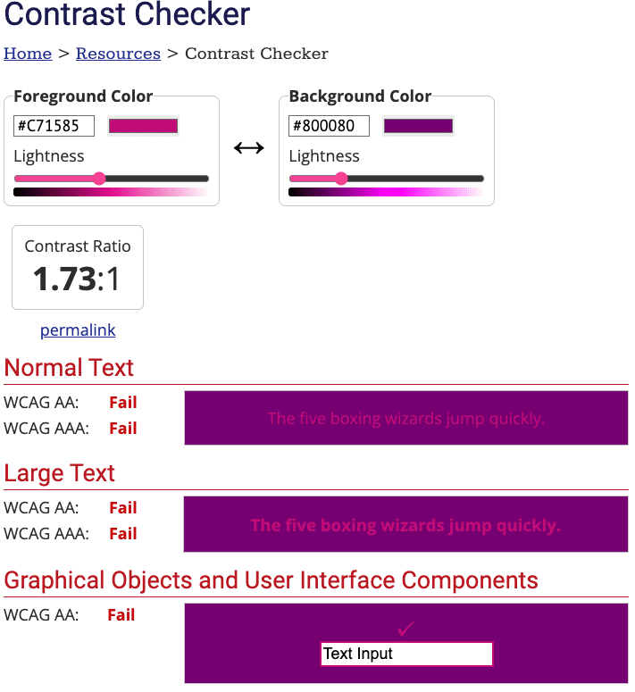
#800080 (Purple) on #C71585 (Medium Violet Red)

This combination poses challenges for users with visual impairments, as the colors have a low contrast ratio, making the text difficult to read.
#FF914D (Orange) on #CB6CE6 (Fushia Purple)

This combination might appear to be accessible, since the orange appears lighter than the purple background however it still does not have enough contrast and overall it’s hard to read.
Updating inaccessible color combinations to meet accessibility standards
If we take one of the examples above and plug the hex values into a testing tool, we can toggle between colors to figure out a more accessible color combination for your website.
#800080 (Purple) on #C71585 (Medium Violet Red)

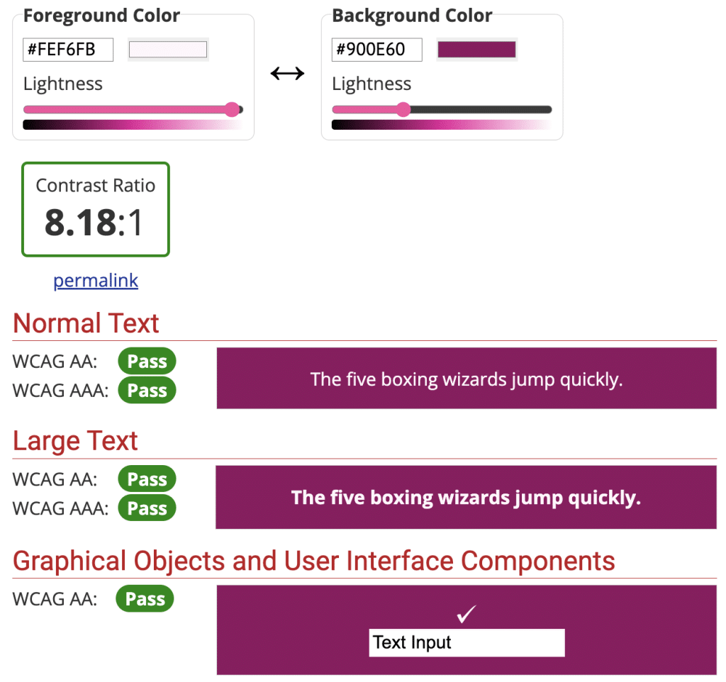
When we toggle the Foreground color to the right, we can see how at one point the color combination passes accessibility standards.
Making the new, accessible color combo: #FEF6FB on #900E60

Adhering to web accessibility standards is essential to ensure that all users, regardless of their abilities, can access and interact with digital content easily.
Proper contrast between text and background colors ensures that the text is legible, reducing eye strain and fatigue for all users. Moreover, it benefits individuals with visual impairments, such as low vision, who rely on screen readers or text magnifiers. When colors are thoughtfully chosen to meet accessibility guidelines, the content becomes more accessible.
Testing saturation with grayscale
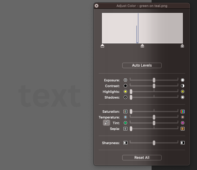
You can also use grayscale saturation to determine if two colors are accessible. If you put two colors together and reduce the saturation, you’ll be able to see the contrast side by side. If the two colors begin to blend together, you’ll know they aren’t accessible. Also, when you add the new hex values of each grey in a color contrast checker tool, you can see that they still appear as not passing accessibility ratios. Consider this example from above:
Without saturation decrease

With decreased saturation

To easily do this, open your image file in Preview on a Mac and go to Tools > Adjust Color and drag the saturation all the way to the left.
Accessible color combinations contribute to an accessible website
Designing with accessibility in mind demonstrates a commitment to complying with legal and ethical standards.
Many countries have accessibility regulations, like the Americans with Disabilities Act in the US, that mandates website owners to create inclusive digital spaces. Most compliance experts consider the Web Content Accessibility Guidelines (WCAG) to be the standard criteria for building accessible websites.
By incorporating accessible color schemes, website owners not only avoid potential legal issues but also cultivate a positive brand image by prioritizing the needs of all users. This proactive approach showcases a company’s dedication to diversity, making it more appealing to a broader audience and reinforcing its commitment to equal access for all individuals.
Color accessibility on websites is not only a moral obligation to create an inclusive digital environment, but it also contributes to better user experiences, readability, and compliance with accessibility standards.
By making accessibility a priority in color scheme choices, website managers and designers can foster an environment of inclusivity, where all users can fully engage with the content and services offered.
As the digital landscape continues to evolve, it is important to promote accessibility best practices to guarantee equal access and opportunity for all individuals.


