
What makes Looker Studio unique
Looker Studio offers a wide range of features that make data visualization and presentation easy – if you know what you’re doing. In Looker Studio, you can display different types of data and express how those data points relate to one another. Looker Studio allows you to create engaging reports and represent thoughtful insights. Most importantly, though, it’s free to use.
While it’s easy to get intimidated by large sets of data, graphs and charts, Looker Studio can be a super simple resource once you get the hang of it. You can read more about what features are included in Looker Studio on Google’s support site.
Looker Studio is a super helpful tool that allows users to understand their progress and determine which direction they want to go in. Looker Studio can effectively outline how a client may want to plan CRO strategies, understand user behavior, or to just make sense of Google Analytics and all the crazy data available in their Google Analytics Dashboard.
Getting started with Looker Studio
First, understand and familiarize yourself with the data.
When approaching a Looker Studio project, it’s tempting to dive in head first. The sophistication and detail that a Looker Studio provides is enough to make anyone want to rush to get started. It’s important to keep in mind that you won’t be able to produce an effective and engaging report if you don’t have the data to support it.
Before you begin your report, make sure that you plan out which data you want to upload to Looker Studio. It is common to use data from Google Analytics (they actually offer a free course on Looker Studio), BigQuery or to upload a CSV which contains data.
Moreover, getting a grasp on the data that you will be working with is an important step in the data visualization process. Don’t skip over reviewing your data! Looking through your data and taking notes on important stats will allow you to get a deeper understanding of the data; therefore, allowing you to present it in a way that makes sense to anyone. During this process it’s important to keep in mind that you’ll want to select data that can tell a story. It’s always easier to explain large sets of numbers when you attach a narrative to them. Try to revisit your initial goals and strategies for inspiration.
What type of reports can you build with Google Looker Studio
At this point, you’re probably thinking about what to use Looker Studio for. There are many different types of reports that can be effectively presented by using Looker Studio. Typically, Looker Studio is used along with data provided by a specific Google Analytics and/or Google Search Console account. Before you connect a data source and start constructing your report, figure out what kind of report you are trying to create. Some typical use cases include:
- Monthly client reports
- Analytics progress
- Goal completions
- eCommerce / Donation tracking
- Website audits
- Content evaluations
- Scientific findings and current updates
Once you’ve established the kind of report to represent your data with, you can begin to brainstorm how you want to display that data.
Plan and visualize your Looker Studio Report
More than anything, creating a report in Looker Studio requires a plan. Users will be able to tell if you just threw together a bunch of charts with random colors. In order to ensure that your data is being presented in an effective and timeless manner, visualize your report before you begin. You can sketch out a draft, look up examples and watch videos about how to best present data. In addition, you can also ask yourself these questions to get you in the Looker Studio mindset:
- What information do your users need to know?
- Which data points will you include to convey this information?
- How can you make the data easy to understand without neglecting information?
- How much user engagement do you want in your report?
Note that these answers don’t have to be final. When creating your report, it’s natural to change your mind and, ultimately, change your plan. It can be easy to get lost in the data and all the features included in Looker Studio. You may find that you want to focus on different stats than you initially thought, and that’s ok! Part of the data visualization process is understanding that you’re going to be learning along the way, which means that your direction may change.
Start creating your report
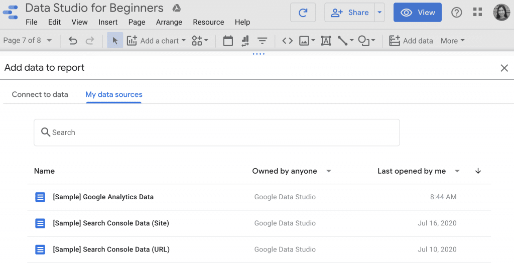
If you want to practice in Looker Studio before starting your report, upload the Sample Google Analytics and Google Search Console data that Looker Studio provides in every blank report. This exercise will give you a better idea of how data will be presented in your report. Additionally, you can use this as a template in the future if you’re satisfied with your result.
Using charts and graphs in Looker Studio
Once you’ve chosen a data source, you can begin to build charts, graphs and tables. Below is a breakdown of potential uses for different types of charts.
Pie charts
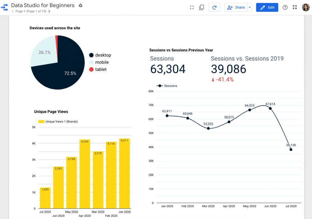
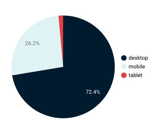
Pie charts are great for displaying less than 3 elements within a data set. For example, showing how users are navigating a specific site by breaking it down by device category. Pie charts are also useful when expressing the contrast between New and Returning users.
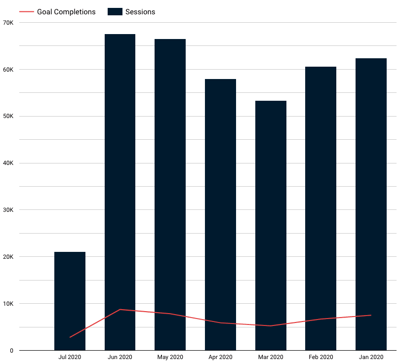
Bar charts
Bar charts help users understand specific data within a timeframe. For example, specific goal completions can be displayed in a bar chart to express data on a month-to-month basis.
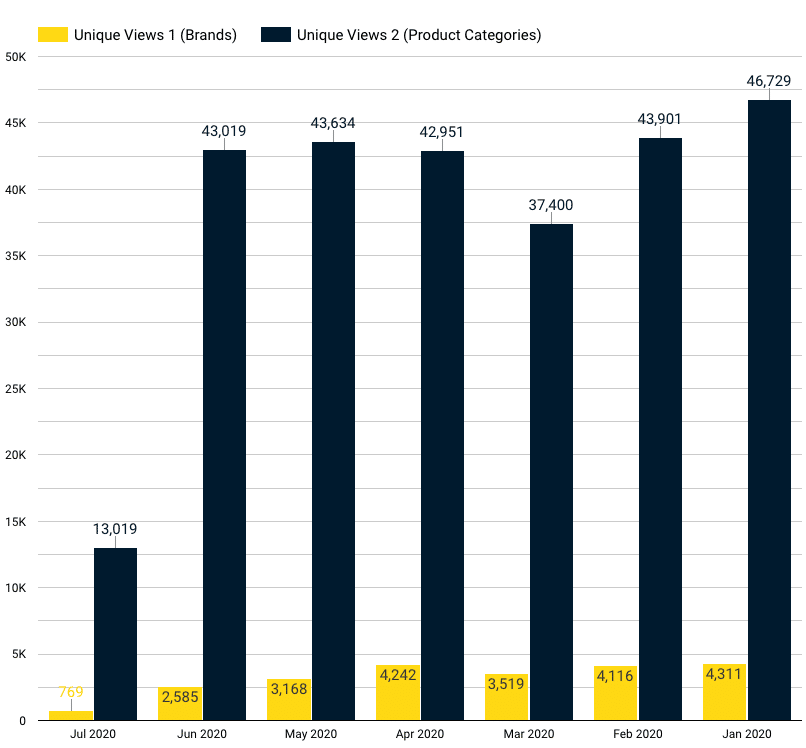
Adding a progress line further helps users interpret how one piece of data works with another.
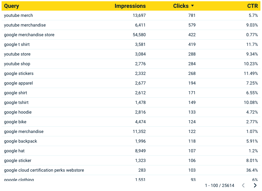
Tables
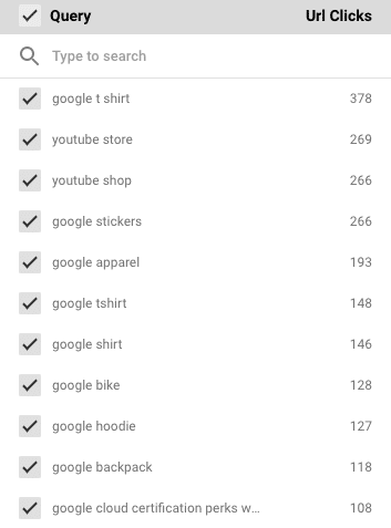
Tables are useful when you want to display multiple types of data. Tables allow users to look through each piece of data to understand overall progress and potential improvement areas. For example, using the example Google Search Console data, you can see data as it pertains to specific queries. This information can be useful when analyzing keyword performance, and interactions based on those keywords.
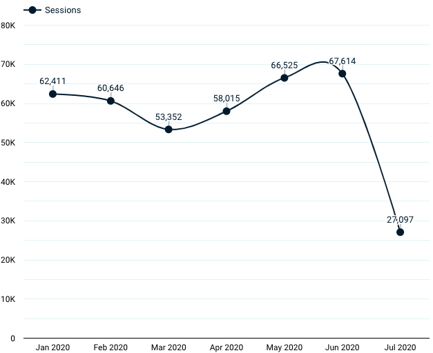
Line charts
Line charts can be used to display trends. For example, in the below chart you can see the relationship between sessions and months. The viewer can better understand which months are bringing more sessions.
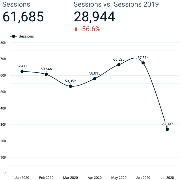
Scorecards
Scorecards are useful when displaying important numbers. Utilizing scorecards alongside another chart or graph can emphasize specific data points that are being displayed in that chart. For example, scorecards can be added to line charts to emphasize important numbers. Additionally, scorecards can effectively show data as it increases or decreases.
Below, the leftmost scorecard displays the total number of sessions from the past 28 days while the scorecard on the right shows sessions to date compared to last year’s total sessions. You can tweak the dates under the Default Date Range section that appears under the fields and metrics you have selected for your scorecard.
Maps
Maps provide geographic data that represents where users and sales come from. By darkening the areas with most activity, users can get a large scale representation of the impact of their business.
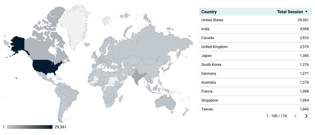
On their own, maps can appear to be obscure so it’s a good idea to add a chart alongside the map to give as much detail as possible.
Keep in mind that these aren’t the only options you should limit yourself to! Don’t hesitate to experiment with other charts and graphs. But remember that the priority should be to effectively convey data that gives users the freedom to make decisions and draw conclusions.
Using Looker Studio Filters
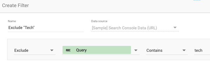
Filters are useful when you want to exclude or include a very specific point within your data. Once you create a filter you will be able to apply that filter to any chart within that report. Filters also give users the option to customize their view and analyze data depending on specific points.
To create a filter, select the chart or graph you want to add the filter to, click add filter and type in the conditions of that filter. For example, if you have a large set of data with different categories and keywords, you can create a filter so that a table only includes a specific category or keywords that contain a specific word.
In addition to internal filters, adding dropdown filters provides the users with more opportunities to engage with the data. Users can use this feature to select an option that gives them a unique view of the table or chart you have provided.
Insert the dropdown above the table which it pertains to.
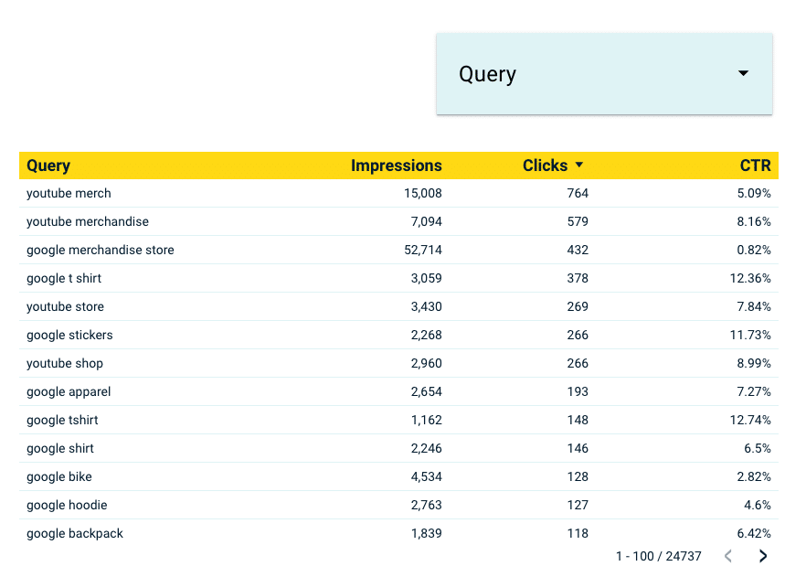
When clicked on, users are presented with all the queries in the table and can choose what to view.
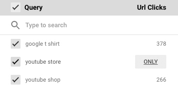
When a large table is overwhelming, adding a dropdown filter gives users an option to control the amount of data they view at a time. When creating filters, it’s important to name each filter with its specific function. Once many filters are created within a report, it can become difficult to remember what each filter does. Being as specific as possible at the beginning will help you out in the long run.
Creating Calculated fields
Calculated fields can be created to display custom calculations based on the available data. While your data will already provide a lot of helpful fields that can effectively represent your data, calculated fields give you the option to further customize and create more tailored functions.
Using calculated fields, you can display totals, averages, specific dates and geographic data in addition to basic arithmetic functions. The Looker Studio Help site offers a great explanation of calculated fields.
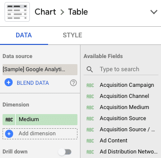
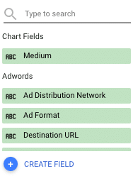
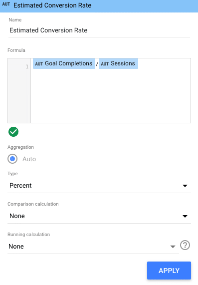
To create a calculated field, go to “add dimension” and click “create field.” Remember to name it something specific so it can be easily identified later.
Using the dimensions and metrics available in your data source you can perform simple math functions. For example, if you wish to determine your estimated conversion rate, divide goal completions by total sessions.
Calculated fields add a deeper level of customization and analysis to any report. When you create a calculated field you can use it across any graph, table or chart in your report.
Blending data in Looker Studio
Data blending allows you to combine data from separate sources and use that as one data source throughout your report. By blending data in Looker Studio, you can combine two separate data sources and use them across the charts in your report.
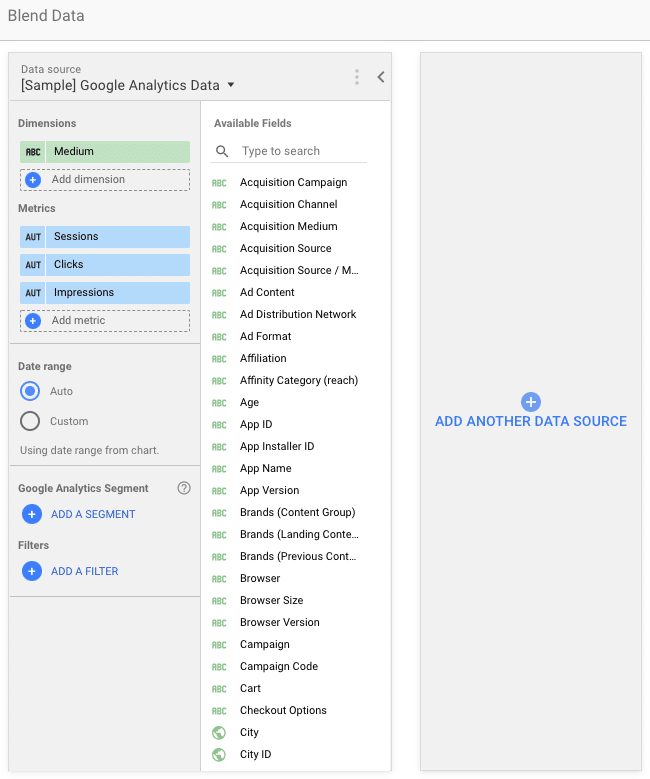
You can preview how two data sets will work together during the blending process. Don’t forget to name the new, blended data source a specific name that you will remember as you continue working on your report.
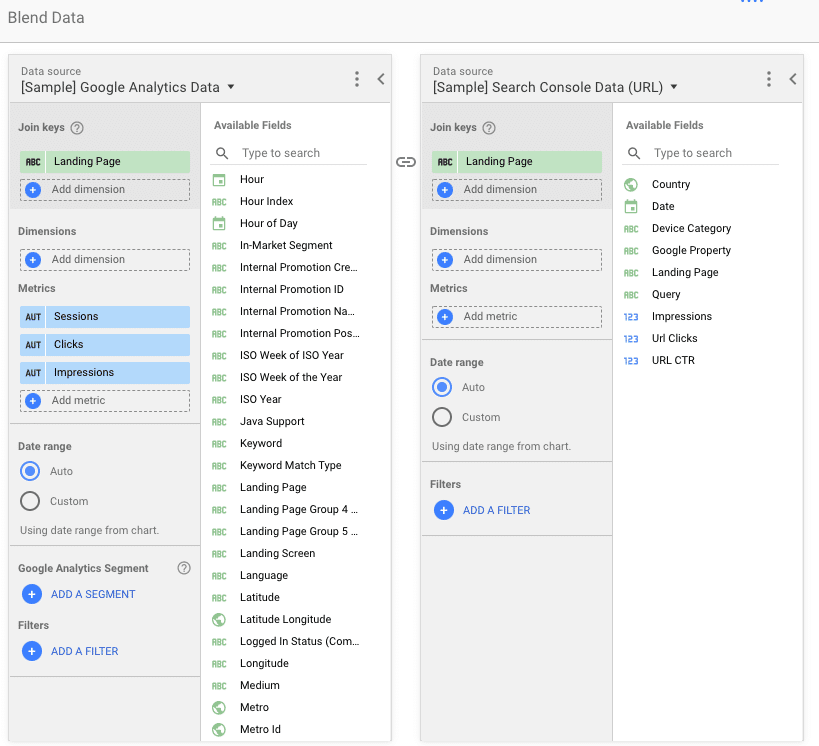
In order to combine data sources, you must have a common element in each data set. This is referred to as a “join key.” Blending data gives you the opportunity to analyze and compare the relationship between the data in one source, making it a simple alternative to comparing back and forth between data sources.
Learn more and get an in depth explanation about blending data on Google’s support site.
Remember, less is often more.
As you can see, there are a ton of things to do in Looker Studio. The program offers many features that allow you to create a unique and engaging report. While it may be tempting to add a lot of pretty features and colors, make sure these additions don’t take away from the data. The priority is to make sure the user can understand the numbers and make decisions based on the data being provided.
How Looker Studio can help you make forward-thinking decisions
To get a better handle on Looker Studio, it’s best to plan before you begin. While this may seem mundane, it will give you a deeper understanding of why you want to present this specific data. Think deeply about what your data will help accomplish and, further, how your Looker Studio report will help you visualize a clear path towards achieving goals and forming strategies. It can be fun to look at each new Looker Studio report as a new opportunity to learn about the program and about the data.
Remember, your first draft may not be perfect! First drafts don’t have to be seen by anyone but yourself and, if anything, they serve as a way for you to track your personal progress. Looker Studio drafts can also be a useful way to keep templates and make notes for yourself. Feel free to send us a note if you’d like some assistance getting started with your report and understanding your data. Happy reporting!